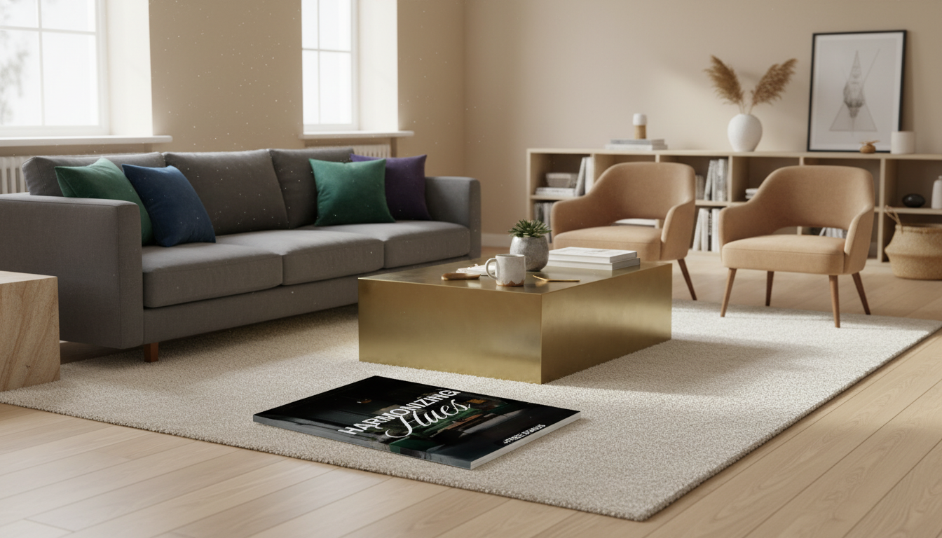
Neutral foundations and jewel-tone accents can feel timeless, cozy, and elevated—when the proportions, undertones, and finishes are chosen with intention. This guide shares a practical, repeatable way to combine creams, taupes, grays, and warm woods with emerald, sapphire, amethyst, and garnet so rooms read layered rather than loud. For more guidance, see Jewel Tone Colors: A Guide to Using Rich Hues – Havenly.
Neutrals provide visual “breathing room,” which makes bold color feel calmer and more deliberate. Jewel tones—deep, saturated hues inspired by gemstones—add instant depth and a clear focal point, especially when they’re placed next to low-chroma colors like stone, linen, putty, or soft wood tones. For further reading, see Jewel Tones: The Best Ways to Add Bright, Saturated Color to Your ….
This pairing is also style-flexible: it can lean modern classic with crisp whites and brass, eclectic with mixed patterns and vintage woods, transitional with greige and velvet, or moody minimal with charcoal and a single richly colored statement.
Most “neutral” paints and fabrics aren’t truly neutral—they carry an undertone. The quickest way to make jewel tones look expensive (instead of accidental) is to match temperature: warm with warm, cool with cool, or keep the base genuinely balanced.
| Neutral base | Jewel tones that typically harmonize | Finishes that reinforce the look |
|---|---|---|
| Warm white / ivory / beige | Garnet, ruby, warm teal, olive-emerald | Brass, antique gold, warm wood |
| Greige / taupe | Emerald, sapphire, aubergine | Aged brass, bronze, walnut |
| Cool gray / crisp white | Sapphire, cool emerald, amethyst | Chrome, nickel, blackened steel |
| Chocolate / deep brown | Emerald, peacock, burgundy | Bronze, black, dark wood |
If you want a deeper dive into how color is standardized and described, resources like Pantone’s color system overview and Sherwin-Williams color fundamentals are helpful references.
Start with a classic 60–30–10 approach: 60% neutral foundation (walls, sofa, large rug background), 30% secondary neutral or wood/texture (chairs, drapery, casegoods), and 10% jewel tone (pillows, art, throws, lampshades). This keeps jewel tones feeling like intentional highlights rather than a takeover.
For a moodier room, shift jewel tone to 30% by using a feature wall, velvet drapes, or an upholstered accent piece, while keeping neutrals as the majority. Whichever ratio you choose, repeat the jewel tone at least three times—small, medium, and large—so it reads cohesive (for example: a pillow, a vase, and a framed print).
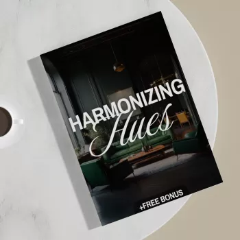
For a streamlined way to build and reuse palettes across rooms, the Harmonizing Hues | Digital Guide on How to Pair Neutral and Jewel Tone | Interior Design eBook, Color Palette Checklist, AI Design Tips offers a checklist-driven framework you can reference while shopping.
Keep the largest pieces neutral—sofa, main rug field, and wall color—then introduce jewel tones with one statement chair, curtains, or a patterned rug that includes both families. If storage and styling are part of the plan, a natural element like the Rectangular Wooden Wall Hanging Shelf for Plants and Home Décor makes it easy to layer warm wood, ceramics, and a small pop of jewel color (like a cobalt vase or emerald glass).
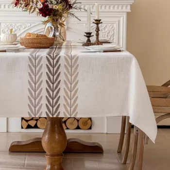
In busy spaces, go smaller: barstools, artwork, table linens, or a painted island in a controlled jewel tone. To soften the overall look, add tactile warm neutrals—an Embroidered Tassel Cotton Linen Tablecloth for Dining & Home Decor can bring in creamy texture that makes sapphire or emerald dinnerware feel even richer.
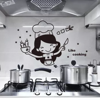
Try a jewel-tone runner or a compact console moment (tray, lamp, and one bold art piece). For a playful, low-commitment accent in a bright kitchen-adjacent entry, the Cartoon Chef Kitchen Wall Sticker – Fun Self-Adhesive Mural for Home & Restaurant Decor adds personality without changing permanent finishes.
A structured workflow turns “pretty inspiration” into a confident shopping list. The Harmonizing Hues digital guide with palette checklist and AI design tips is designed for quick decisions: pairing rules, reusable templates, and prompts that keep visualizer results consistent and realistic.
Emerald, sapphire, burgundy, and aubergine are versatile because they hold their richness next to common neutrals like ivory, greige, and charcoal. Start small with pillows, art, or one accent chair, then repeat that color in two more spots for a cohesive look.
One hero jewel tone is usually enough, with optional small supporting accents that stay muted or tonal. Use a 60–30–10 proportion as a baseline and repeat the hero color at least three times so it feels intentional.
Yes—keep the base light (walls, ceiling, or large upholstery) and use jewel tones in controlled areas like textiles, a single feature wall, or compact statement furniture. Add mirrors, layered lighting, and texture to prevent the space from feeling heavy.


Leave a comment