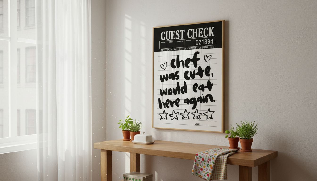
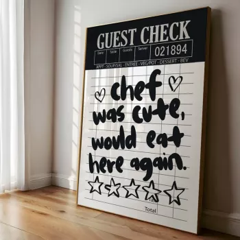
Retro Chef Wall Art: A Small Upgrade That Changes the Whole Kitchen Mood
A retro chef wall art print adds instant character to kitchens, breakfast nooks, apartments, and dorm rooms—bringing a lively, vintage-inspired vibe without needing a full redesign. One bold graphic can make even the simplest setup feel intentional, from a compact coffee station to a tiny dorm kitchenette. Below are practical styling ideas, placement tips, and easy ways to build a cohesive look around a playful print like the Retro Chef Wall Art Print.
What Makes a Retro Chef Print Such a Statement Piece
Poster-style art has a long history of grabbing attention fast, using strong shapes, clear subjects, and high-contrast color to communicate at a glance—one reason it feels so at home in kitchens and dining spaces. (For a quick overview of poster culture and why bold prints read as “instant décor,” see Smithsonian Magazine — A Brief History of the Poster.)
- It creates a focal point. A retro chef instantly sets the tone—fun, friendly, a little nostalgic—so the rest of the room can stay simple.
- It fits multiple aesthetics. Café corners, diner details, mid-century color, and eclectic thrifted finds all pair naturally with a chef motif.
- It’s ideal for small spaces. In apartments and dorms, one graphic piece can do most of the “decorating work” without adding clutter.
- It lifts neutral kitchens. White cabinets, stainless steel, and plain counters look sharper when the wall art brings the personality.
Where It Looks Best: Placement Ideas for Kitchens, Apartments, and Dorms
Placement is less about following strict rules and more about choosing a spot you see often—then giving it a little breathing room. The goal is to make the print feel like it belongs there, not like it was squeezed into the last empty patch of wall.
- Above a coffee bar or snack station: Instantly turns a small setup into a “mini café” moment.
- Near the stove or prep area: Keep it away from direct heat and splatter zones; think “nearby,” not “right above.”
- Over a small dining table or breakfast nook: Anchors the seating area and pulls the room together.
- In a dorm kitchenette near a microwave cart: Helps utilitarian zones feel curated instead of temporary.
- On a gallery wall: Mix with food-themed prints, menu-style typography, or vintage ad art for a collected feel.
Placement guide for a balanced look
| Spot |
Why it works |
Quick styling tip |
| Coffee corner |
Reinforces a café vibe and draws attention to a small setup |
Add a small tray, mugs, and one plant to echo the print’s energy |
| Dining nook |
Creates a focal point for conversation and meals |
Center it to the table; keep the rest of the wall minimal |
| Kitchen entry wall |
Gives an instant “welcome” moment without cluttering the cooking zone |
Pair with a small hook rail or a single shelf |
| Dorm snack station |
Makes a compact space feel curated and less temporary |
Match one color from the print with a towel or mini rug |
Styling Themes That Pair Well With a Funky Chef Print
The easiest way to make a bold print feel “designed” is to pick a theme direction, then repeat just a couple details—one color, one material, one pattern. That’s enough to look cohesive without forcing the room into a costume.
- Retro diner: Red accents, checkerboard details, chrome or stainless accessories, and simple barware shapes.
- French bistro: Black-and-white touches, café-style glassware, and warm wooden boards for balance.
- Mid-century playful: Warm woods, geometric patterns, and one bold accent color that shows up twice.
- Eclectic apartment aesthetic: Mixed frames, thrifted ceramics, and colorful linens that feel collected over time.
- Minimal kitchen, one bold piece: Keep counters clear and let the print carry the personality.
Framing, Hanging, and Wall-Friendly Setup Tips
- Choose a frame that matches the vibe. Black feels like a classic poster; natural wood warms up white kitchens and softens bold graphics.
- Go damage-free when needed. In rentals and dorms, removable hanging strips or a poster rail can keep walls intact—just clean the wall surface first and use the correct weight rating.
- Hang at a comfortable viewing height. In dining areas, eye level works well; in kitchens, a touch higher helps avoid splash zones.
- Keep spacing consistent in a cluster. If you add companion pieces, aim for even gaps (about two fingers between frames) to avoid a messy look.
Building a Coordinated Kitchen Corner Around the Print
Gifting and Occasion Ideas
Care and Longevity Tips for Kitchen-Adjacent Wall Art
Options to Complete the Look
FAQ
Will this work in a dorm or rental where nails aren’t allowed?
Yes. Use removable hanging strips rated for the frame’s weight, a poster rail, or a lightweight frame option; wipe the wall clean first so adhesives grip properly.
Where should it hang in a kitchen to avoid grease or moisture damage?
Place it away from the stove and sink splash zones and avoid spots with frequent steam. A frame with a protective front (like acrylic) makes wipe-downs easier if it’s near prep areas.
What décor styles pair best with a retro chef print?
Retro diner, French bistro, mid-century playful, and eclectic mixes all work well. Match one or two colors from the print through small accents like towels, mugs, or a mini rug for a cohesive look.
Recommended for you


Leave a comment